Measuring health inequalities
Health inequalities have been defined as the ‘systematic differences in the health of people occupying unequal positions in society’. These differences are primarily ‘unjust and avoidable’. They are complex, and can be observed in relation to many different, often overlapping, social dimensions: income, social class, geography, ethnicity, disability, gender and more. Inequalities can be observed between groups of different dimensions, some of which are rankable such as income, and some are not such as ethnicity (see key references: Graham, 2009; Beeston et al, 2013).
Measuring and monitoring how different aspects of health vary between groups is of critical importance because it can provide a deeper insight into the health problems of a community and help to identify if any groups may be more vulnerable than others. It can help to assess the progress of existing health interventions as well as inform future policies, programmes and practice in reducing any observed inequality.
There are a variety of methods used to measure health inequalities. Listed below are a selection of commonly used measures along with links to further details about each of the methodologies.
ScotPHO have produced an Excel tool and example R code to help calculate different inequality measures. These resources have been created for public health practitioners and analysts to help them interpret their data more easily, by providing guidance in measuring inequalities using a number of different methods. The World Health Organization (WHO) and Public Health England (PHE) have also produced useful tools to help calculating health inequalities which may be of further interest.
- Which measure should be used?
- Range
- Population attributable risk
- Slope index of inequality and Relative index of inequality
- Concentration index
- References
The following diagram was constructed using information adapted from Regidor (2004) and WHO (2017). The diagram is designed to help to decide what measure is most appropriate for your data and for your research question. A group of widely-used measures are explained in detail later in this page. In the future more will be included.
What is the unit of observation?
Often we do not have a measure of deprivation and of the health outcomes we are interested in for each person. Instead we tend to use values for an area as a proxy. However, deprived people might live in non-deprived areas and vice versa, which underestimates the true relationship between deprivation and health outcomes.
What type of measure is best to use?
It is important to establish the objective in measuring health inequality (see Figure 1). Based on this, a number of different measures may be used. While there is not necessarily a straightforward answer to which measure is most appropriate, it is important to take into account the advantages and disadvantages of each method. It is also important to recognise and acknowledge any limitations in the conclusions drawn.
Is an absolute or relative measure (or both) relevant?
Methods used to measure inequalities in health can be further split into absolute and relative measures. Absolute measures describe the size of the difference and relative measures show proportional differences between groups being compared. It is usually good practice for monitoring health inequalities to calculate and report on both relative and absolute measures. It is not appropriate to use one for some measures and the other for others and then compare these.
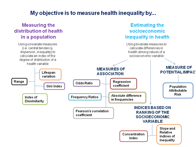
Figure 1. Flowchart constructed using information adapted from Regidor (2004) and WHO (2017).
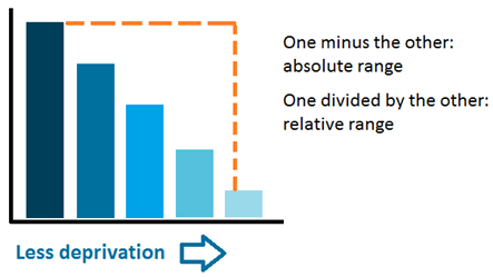
The range is the difference between the values of the most and least advantaged groups. It is unweighted, which means that it doesn't take in consideration the size of the population of each group.
The range can be expressed in absolute and relative terms. The absolute range is the difference between most and least disadvantaged; while the relative range can be either the most disadvantaged divided by the least disadvantaged, or the least disadvantaged divided by the most disadvantaged.
Advantages and disadvantages
+
The range is straightforward and easy to explain and understand.
-
The range only uses the groups with the minimum and maximum values and therefore does not take into account any intermediate groups. This can be minimized by widening the comparison; for example using the two most advantaged and least advantaged groups instead of only the most and least. Inequalities using this measure will be greater the more disaggregated the population ranking measure is.
How to calculate this measure
Absolute range: Most disadvantaged group - least disadvantaged group
Relative range: Most disadvantaged group/least disadvantaged group;
or Least disadvantaged group/most disadvantaged group
How to interpret this measure
For the absolute range, the magnitude of the value represents the level of inequality. A value of zero would indicate no inequality and a higher absolute value indicates greater inequality.
For the relative range, a value of 1 indicates no inequality and the further the value is from 1 the greater the inequality.
References
Wagstaff, A., Paci, P., & Van Doorslaer, E. (1991). On the measurement of inequalities in health(1.4Mb). Social science & medicine, 33(5), 545-557.
Regidor E. (2004) Measures of health inequalities: part 2. Journal of Epidemiology & Community Health, 58(10), 900-903.
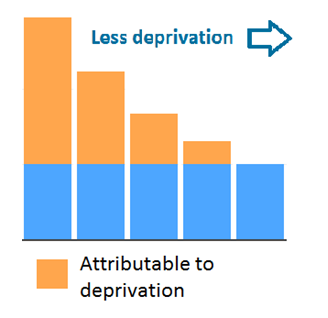
This measure aims to quantify how much of a health outcome can be explained by an inequalities characteristic. It uses the least disadvantaged area or the area with the best value for the measure studied as a baseline and quantifies everything over this value as attributable to inequality. What baseline to use will depend on the objectives of the analysis.
It allows us to understand how a particular health aspect could improve if all groups had the same level of outcome.
Advantages and disadvantages
+
The results of this measure are easy to interpret and can be used to establish reduction targets. Another benefit of using this measure is that it takes into consideration the population size of each group.
-
It uses the least disadvantaged group as the reference point, which sometimes might not be desirable.
The population attributable risks for multiple exposures can sum to more than 100%, which can make explanation difficult.
The population attributable risk makes the assumption that all of the association between the risk factor and health indicator is causal. In reality there could a number of other factors influencing the trends observed.
How to calculate this measure
Population attributable risks can be calculated as follows:
PAR = (Vgroup/Vleast -1) * (Pgroup/Pall) * 100 [final result is a percentage]
Where
Vgroup = value for the group (numerator, rate, percentage)
Vleast = value for the least disadvantaged population
Pall = population for the whole population
Pgroup = population for the least disadvantaged population
To calculate an overall population attributable risk for multiple groups (for example a group of areas with different levels of deprivation) the population attributable risk for each group needs to be calculated and then summed. Using the first method described to calculate it this would be the steps to follow:
- Calculate risks for each group with the formula described above.
- Sum together risks for all groups: calling this SumPAR
- Calculate the population attributable risk for all the groups: SumPAR/(SumPAR + 1)
How to interpret this measure
It is usually presented as a percentage that varies between 0 and 100. A value of 0 would indicate that the factor assessed has no impact at all and that there is no inequality, and higher values would point to increased inequality.
References
Schneider, M. C., Castillo-Salgado, C., Bacallao, J., Loyola, E., Mujica, O. J., Vidaurre, M., & Roca, A. (2005). Methods for measuring health inequalities (Part II). Epidemiological Bulletin, 26(2), 12-5.
Regidor E. (2004) Measures of health inequalities: part 2. Journal of Epidemiology & Community Health, 58(10), 900-903.
Rockhill, B., Newman, B., & Weinberg, C. (1998). Use and misuse of population attributable fractions. American Journal of Public Health, 88(1), 15-19.
Laaksonen, M. (2010). Population attributable fraction (PAF) in epidemiologic follow-up studies.
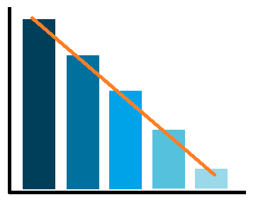
The relative index of inequality (RII) and the slope index of inequality (SII) are used to quantify the relative and absolute inequality gap, respectively. They are similar to the ranges, but taking in consideration the values for all of the groups and the population size of each group. For this reason they assume the data is ranked, for example from most deprived area to the least deprived one.
These indices make assumptions about the nature of the relationship between socioeconomic measure and the health outcome. There are two main methods,one using a linear regression and assuming a linear relationship, and one using a Poisson regression and assuming a non-linear relationship.
The two approaches have different strengths. Poisson is better used with rare events such as deaths and when the relationship between the social indicator and the health outcome is not linear. The linear approach allows an investigation of the causes of inequality (for example mortality inequality by cause of death). It was the approach more widely used until Moreno-Betancur et al. (2015) proposed an alternative method using Poisson regression. The interpretation of both methods for RII is different and Poisson might be easier to understand. Both methods provide similar conclusions for RII. ScotPHO uses the linear regression approach in the triple I work and in the profiles tool.
Advantages and disadvantages
+
These measures describe the inequality across the full population.
They take in consideration the population size of each group.
-
It is only suitable for socioeconomic measures that can meaningfully be ranked in order, like area deprivation. It is not suitable for measures like ethnicity that cannot be ranked in this way.
The linear approach assumes there is a linear relationship between the health measure of interest and the socioeconomic measure being assessed.
How to calculate this measure
Both approaches fit a regression (liner or regression) to the ranked values of each group. To calculate SII run a linear/additive Poisson regression between the rank of the social variable and the chosen measure of health outcome. To obtain the linear RII, divide the SII by the overall value for the whole population. To obtain the Poisson RII run a Poisson regression. For more details on the Poisson approach see Moreno-Betancur et al. (2015). For more details on the linear approach see the example code prepared by ScotPHO.
How to interpret this measure
The SII represents the inequality gap across the whole population between the most and the least disadvantaged. For example a SII of 127 for the asthma hospitalisation rate means that the difference between the most and the least disadvantaged groups is 127 hospitalisations per 100,000 population.
The linear RII usually ranges between -2 and 2. It can exceed 2 when the relationship is not linear. If the linear RII is multiplied by 0.5 and expressed as a percentage it can be interpreted as follows (using the example of area deprivation) "the most deprived group has a rate xx% above/below the average value of the whole population". For example, a linear RII of 1.8 means that the rate is around 80% higher in the most deprived group relative to the mean rate in the population.
The Poisson RII indicates the ratio between the most and least diadvantaged groups. If it is equal to 1, there is no inequality, and higher values will indicate worse outcomes in the most diasadvantaged group. For example, a Poisson RII of 2 for asthma hospital admissions means that the most disadvantaged group has twice the rate of the least disadvantaged one.
References
Pamuk, E. R. (1985). Social class inequality in mortality from 1921 to 1972 in England and Wales. Population studies, 39(1), 17-31.
Wagstaff, A., Paci, P., & Van Doorslaer, E. (1991). On the measurement of inequalities in health(1.4Mb). Social science & medicine, 33(5), 545-557.
Regidor E. (2004) Measures of health inequalities: part 2. Journal of Epidemiology & Community Health, 58(10), 900-903.
Schneider, M. C., Castillo-Salgado, C., Bacallao, J., Loyola, E., Mujica, O. J., Vidaurre, M., & Roca, A. (2005). Methods for measuring health inequalities (Part II). Epidemiological Bulletin, 26(2), 12-5.
Moreno-Betancur, M., Latouche, A., Menvielle, G., Kunst, A. E., & Rey, G. (2015). Relative index of inequality and slope index of inequality: a structured regression framework for estimation. Epidemiology, 26(4), 518-527.
Conway, D.I., McMahon, A.D., Brown, D. & Leyland, A.H. (2019). Chapter 4. Measuring socioeconomic status and inequalities (358Kb) in Vaccarella, S., Lortet-Tieulent, J., Saracci, R., Conway, D. I., Straif, K., & Wild, C. P. (2019). Reducing social inequalities in cancer: evidence and priorities for research. IARC Scientific Publication.
The concentration index reflects the relationship between the cumulative proportion of the population and the cumulative proportion of the social measure (deprivation, employment, etc) being used. Population groups are ranked by the social measure.
It is easily represented by drawing two lines. If, for example, area deprivation is being used as the socioeconomic measure, then one line would show the cumulative population from least to most deprived groups, and the other would show the cumulative health measure from least to most deprived. The area between the lines represents the inequality gap. The concentration index is calculated based on that area.
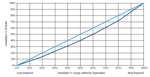
Advantages and disadvantages
+
This measure describes the inequality across the entire population.
It takes into consideration the population size of each group.
-
It is a difficult measure to interpret and understand in terms of what the variations mean in real terms.
It is only suitable for socioeconomic measures that can meaningfully be ranked in order, like area deprivation. It is not suitable for measures like ethnicity that cannot be ranked in this way.
How to calculate this measure
The formula is:
C = (p1L2 - p2L1) + (p2L3 - p3L2) + .... + (pT-1LT - pTLT-1)
where: p is the cumulative percent of the population ranked by socioecomic measure, L(p) is the equivalent for the health aspect and T is the number of groups.
How to interpret this measure
It varies between -1 and +1. If the value is 0 there is no inequality. If it is negative, more disadvantaged groups have worse outcomes. If it is positive, least disadvantaged areas have worse outcomes. The larger the area between both lines the bigger the inequalities.
If the concentration index is multiplied by 75, it can be interpreted as the percentage of the health aspect that needs to be removed from the most disadvantaged to obtain equality.
References
Wagstaff, A., Paci, P., & Van Doorslaer, E. (1991). On the measurement of inequalities in health(1.4Mb). Social science & medicine, 33(5), 545-557.
Regidor E. (2004) Measures of health inequalities: part 2. Journal of Epidemiology & Community Health, 58(10), 900-903.
On health inequalities
Beeston C., McCartney G., Ford J., Wimbush E., Beck S., MacDonald W., Fraser A. Health Inequalities Policy review for the Scottish Ministerial Task Force on Health Inequalities. Glasgow: NHS Health Scotland; 2013.
Graham H. The challenge of health inequalities. In: Graham H. (Editor). Understanding health inequalities. Maidenhead: Open University Press; 2009
Overview of measures
In addition to the references cited for each measure, we recommend these articles as they cover a wide range of health inequality measures and they are described in a simple way:
World Health Organization (2017). Health Equity Assessment Toolkit (HEAT): Software for exploring and comparing health inequalities in countries. Built-in database edition. Version 2.0. Geneva.
Carr-Hill, R. & Chalmers-Dixon, P. (2005). The Public Health Observatory Handbook of Health Inequalities Measurement. Centre for Health Economics, University of York.
Wagstaff, A., Paci, P., & Van Doorslaer, E. (1991). On the measurement of inequalities in health. Social science & medicine, 33(5), 545-557.
Regidor, E. (2004). Measures of health inequalities: part 1. Journal of Epidemiology & Community Health, 58(10), 858-861.
Regidor E. (2004) Measures of health inequalities: part 2. Journal of Epidemiology & Community Health, 58(10), 900-903.
Conway, D.I., McMahon, A.D., Brown, D. & Leyland, A.H. (2019). Chapter 4. Measuring socioeconomic status and inequalities in Vaccarella, S., Lortet-Tieulent, J., Saracci, R., Conway, D. I., Straif, K., & Wild, C. P. (2019). Reducing social inequalities in cancer: evidence and priorities for research. IARC Scientific Publication.
USA National Cancer Institute. Health Disparity Measures and Calculator.
Comparison
We recommend these articles to understand the advantages and disadvantages of a wide range of health inequality measures:
Alonge, O. & Peters, D. H. (2015). Utility and limitations of measures of health inequities: a theoretical perspective. Global Health Action, 8, 10.3402/gha.v8.27591.
Drakou, I. (2017). Measurement methods of inequalities in health services.